Terracea is a new outerwear company founded by two longtime friends and avid snowboarders. When Terracea first approached Inphantry, they had just changed their name from Switch Apparel Company and were looking to update and refine their brand identity. They didn’t want to build a company or sell products that only catered to pro skiers and snowboarders—they were on a mission to create the perfect jacket for any kind of outdoor enthusiast, and the brand needed to reflect that. Terracea comes from a combination of the words Terra, meaning Earth or land, and Panacea, defined as a cure-all or a solution. Together, it means a remedy for anything the earth can throw at you.

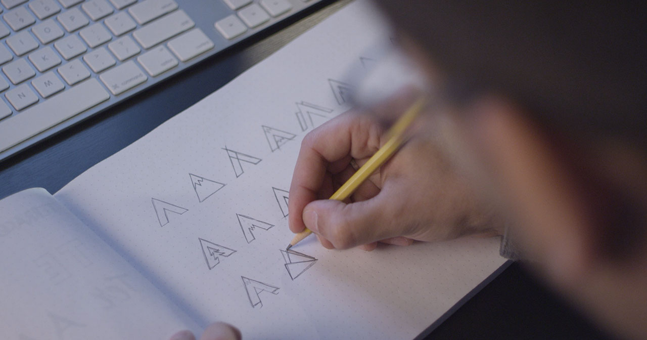
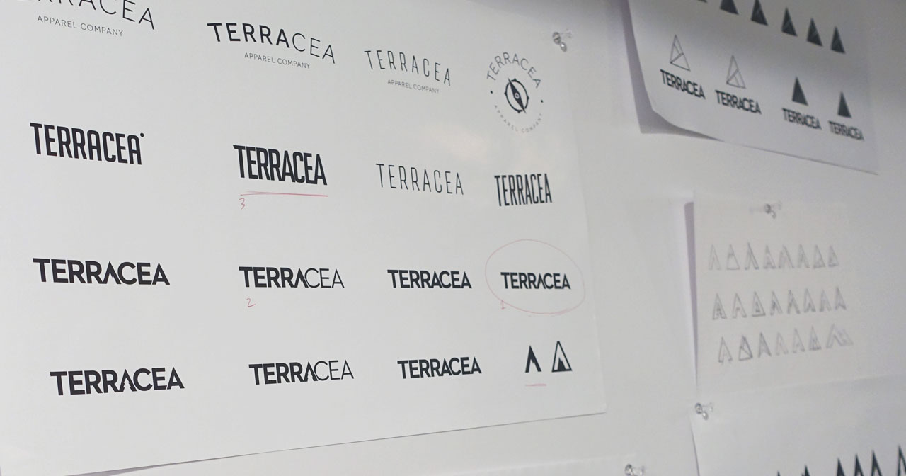
After spending time with Terracea’s co-founders Brian and Eric, we soon realized they were drawn to bold, straightforward wordmarks, and that’s the same vision they had for their new brand. We explored ways to give them a wordmark with an element that could be removed and used as its own mark: a standalone icon that would be easily discernible and still represent the brand. Because they work in apparel, the perfect mark would seamlessly carry over to small details like a zipper or embroidery on a shoulder or the back of a jacket’s neck. Following a few rounds of design and a lot of exploration, we landed on using the first A as that element, which also represented where the word Terra ended and fed into Panacea. The brand’s colors are a mix of neutral blue, dark gray and off white, with red and teal providing contrast.

Once the visual identity was set, Inphantry established a brand guidelines book for Terracea; one they could share with all future vendors and partners to ensure brand strength and consistency (especially across different iterations of their outerwear, apparel and accessories). This book included guidelines on logo/mark usage, colors, typography and photography direction.


